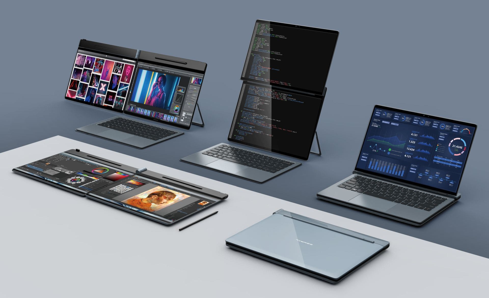
As whistleblowing platforms become more widely adopted across sectors, user experience (UX) plays a crucial role in determining whether individuals actually feel comfortable using them—especially when comparing mobile and desktop access. On desktop, users typically benefit from a larger screen, full keyboard input, and easier access to supporting documents, which can be helpful for drafting detailed reports or uploading attachments. The layout often provides more visibility and structure, making it suitable for handling sensitive or multi-step submissions. However, not all employees or collaborators work from behind a desk. For those in the field, on the move, or in environments where desktop use isn't practical, mobile access offers the flexibility needed to speak up without delay. A well-designed mobile whistleblowing system allows users to record voice messages, upload images, or submit quick updates directly from their phones. This level of accessibility can increase reporting rates and remove barriers for individuals who might otherwise stay silent. Still, the mobile experience must be simple, secure, and clear, since smaller screens and limited input methods can lead to mistakes or confusion if the interface is poorly designed. Offering both options—desktop for detail, mobile for speed—gives users the freedom to report in the way that works best for them, helping create a more accessible and responsive system.